We have introduced Heatmaps for Races and Partners (folks who manage multiple races). Here is an example of a small Race Series Partner Heatmap:

You can see the cities where they have races and how many people relatively have signed up from each area. The Philadelphia area is hot (pun intended) for them.
As you drill down closely, you can see the zipcodes and how many people have registered for each zipcode (this will show lifetime registrations for races, but Partners can drill down more finely). In the example below from the Scott Coffee race, most people come from 08057 (Moorestown), with 1,609. 08054 had 377 and 09077 had 178.

This can be very useful for figuring out which zipcodes to target market with ads on Facebook, and other places.
For example, in this partner’s heat map of the Denver suburbs, you can see which zipcodes should be targeted the most – 80229 has 200 people registered, but they should not target the area right below if where I270 and I70 split.

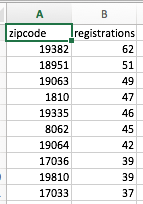
There is also a convenient CSV download which will download all of the zipcode and how many in each.
The map is drawn based on the location of the top 1,000 zipcodes. Colors are automatically applied to the most densely populated (Red) to the least densely populated (Green). The colors are proportional, so if there is a large disparity like the Scott Coffee race above you will still see Red. If there is a diverse set of races and zipcodes, then drilling down will yield more green like the Denver example above.
Partner Heatmaps are under the Participants Menu. Race Heatmaps are under the Reports -> Marketing Reports menus.

