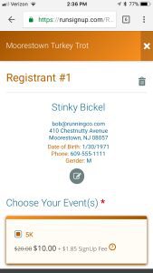
We have released a MAJOR upgrade to the core registration process participants follow to signup for your events as part of our User Experience Manifesto.
It is designed for mobile first, with a cleaner look and feel, better flow, improved visibility for groups and teams, a great looking checkout page, and some cool UX tricks like flipping credit cards!
For the next week or so, while we gather feedback, this is optional. You can select the new registration process under the Race Theme page in your dashboard. After that, we will default all races to this mode – so provide feedback if you have some.

Mobile First
Phone view of some major pages:

Full Screen
One of the key new designs is the full screen approach – we used to keep registration inside the frame of the race website. It now takes over the whole screen. This creates a cleaner user experience, and we expect fewer distractions and more complete registrations. The form elements are also newly designed, as is the header.

Color
We have also spent a lot of time to work on color matches and readability even when our customers make “questionable” color choices:-) And you will notice we are picking up our new ombré color transition on headers (fades from dark to light from left to right):

Teams
We have made joining groups and teams much clearer on the right along with cleaner demarcation between events with the drop shadow borders:

And the pop-up is cleaner:

Store and Add-On Items
This page also has been cleaned up with a better looking selection box:

Checkout
The checkout page is also segmented into logical areas with nice frames to set out the important information like Registration Cart on the right:

Credit Card
And we have a new cool design for credit cards. The actual card changes color and logo depending on the type (AMEX, VISA, MasterCard and Discover) as you start to type:

And when you enter the CCV, the card actually flips (or stays on the front side for AMEX)!

Optional Processing Fee Payment
If your race has the option for the participant to pay the fee (this is common for donation and fundraising events), the new look is designed to increase participation:

Confirmation Page
And we’ve added a little celebration on the confirmation page, along with an easier to read and understand layout:

We are pleased to be putting out substantial improvement to our User Experience – because it really becomes your race’s User Experience for your participants. And we are here to make you look good!
Next on the plate for participants is a new look for your race website – wait until you see what we have planned…
