Overview
One of RunSignup’s Engineering Guiding Principles is that we put a high value on User Experience. With over 30,000 events per year and millions of user interactions, high usability improves user satisfaction and ultimately allows us to keep costs down for our customers by providing successful self-service experiences. We support this principle with a dedicated staff of usability experts, a commitment to accessibility, and a set of standard UI components and patterns that are used across the application. We thought we might provide this case study to give you an idea of the details that go into making easy to use software.
Background
Resetting a password isn’t a glamorous part of an application, but it’s critical. It’s the gatekeeper to everything else users want to do. This case study outlines the redesign of our reset password page, a commonly overlooked but essential part of our user experience. The goal was to reduce user frustration, improve accessibility, and lower support requests related to password issues.
This project was initiated after a frustrated user contacted our support team—and later posted publicly—about the difficulty they experienced trying to reset their password. We regularly monitor statistics on issues that are hitting our support team, to better understand where our platform might need improvement. This was the first time our support team had escalated such an issue directly to design, highlighting a larger underlying problem. The data supported it and we decided we needed to make this process easier for users.
Darren a senior UX Engineer at RunSignup, took on this project.
The Problem
Through conversations with the support team, he learned that up to 30% of our customer support tickets were related to password reset issues. He decided to investigate.
Walking through the existing flow as if he were a new user, he found several pain points:
- The visual design was outdated and not aligned with our current UI patterns
- Password requirements were hidden inside a small tooltip, only revealed mid-interaction
- No real-time feedback was provided to guide users through password creation
- The form lacked accessibility considerations, especially for users with color vision deficiencies
Interface prior to any updates:

Design Goals
- Modernize the visual design and layout
- Make password rules clear and visible from the start
- Provide real-time, intuitive feedback during input
- Improve accessibility for all users, including those with visual impairments
- Reduce support volume related to password reset confusion
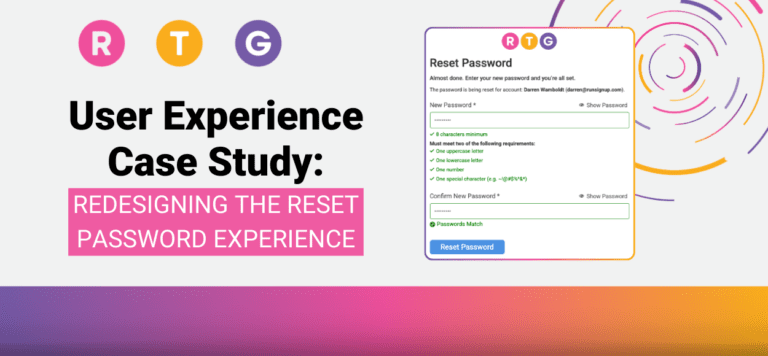
Key Improvements
- 🔍 Clearer Page Design & Context
- Updated layout using our current design system
- Added a concise instruction message that confirms whose account is being updated
- 📋 Visible Password Requirements
- Requirements are now listed below the password field, always visible
- Each requirement is accompanied by an icon for clarity
- ✅ Real-Time Feedback
- As users type, password requirements dynamically update:
- Gray icon: not yet met
- Green checkmark: requirement fulfilled
- A confirmation message appears when the password and confirmation fields match
- As users type, password requirements dynamically update:
- ♿ Accessibility Enhancements
- Initial unmet state changed from red to gray to improve color differentiation for colorblind users
- Ensured sufficient contrast and tested with a colorblindness simulator
- Improved form labeling and ARIA attributes for screen readers
The Details
What we did to improve the user experience. Here are the details of how we changed the interface and some rationale around our decisions.
Initial State
Overall interface redesign. Clearly show password requirements

Real Time Feedback
As the new password is entered, the state of the requirements are visually updated.
As all requirements are met, a circle icon and lighter text indicate that the remaining requirements are not necessary.

Password Confirmation
We also added a password confirmation notice that clearly indicates when your passwords match. Not being able to know when the passwords matched was a common complaint among users.

Password Peek
Adding the ability to see the password while entering it further assists the user in creating and confirming their passwords.

Understanding Color Contrast Issues
At first we were using green and red to indicate completed and not completed states.
But after testing for color blindness it became clear that using these colors would cause issues. The green and red colors look almost the same. The only way to distinguish between the states was by the icon.
The image at the right shows how the requirements looked to a color blind user.

Solving Color Contrast Issues
To solve this usability issue we decided to use green for completed state and gray for the not completed state. This created a more accessible and easier to understand interface.
Testing the new colors reveals a better distinction between the states. See the image below for a comparison.

Tools & Methods
- Design and prototyping: Figma
- Accessibility testing: Stark plugin, manual color simulation, Color blindness image checker (https://www.color-blindness.com/coblis-color-blindness-simulator/)
- Feedback loop: Weekly check-ins with support + user feedback review
Results & Early Impact
- Reduction in password reset–related support tickets (initial support feedback is positive)
- Improved user confidence during password creation, thanks to real-time feedback
- Greater accessibility compliance, reducing friction for color blind and screen reader users
Lessons Learned
- No part of the user journey is too small to impact satisfaction and trust
- Designing for accessibility improves the experience for all users
- Internal collaboration with support teams uncovered valuable insights early
Next Steps
- Continue monitoring support ticket volume related to password resets
- Explore adding copy suggestions or password strength indicators
- Consider applying similar real-time feedback patterns to other forms in the app
Usability analysis and enhancements like these are part of our ongoing efforts at RunSignup. We hope this gives you a glimpse into how we continually work to deliver an outstanding experience for our users