
This is part of our ongoing Membership Features Series, highlighting tools and best practices for membership organizations using RunSignup. This is part 1 in the series. Here’s Part 2: Recommended Website Features, Part 3: People vs Organization Membership Levels, Part 4: Auto-Renewals, and Part 5: Saved Reports.
As our Membership Organization product continues to grow and evolve, we’re excited to launch a new blog series highlighting some of its new and most powerful features. Each post will explore a specific tool or capability designed to help organizations better manage their members, engage their communities, and gain valuable insights from their data.
This blog will focus on the new and improved Membership Organization Dashboard analytics and insights.
On the “Dashboard” tab of your Membership Organization Dashboard, we have added a number of key charts and graphs to give you an overview of how your organization is performing over time.
Current Snapshot
The top of this page shows a recent snapshot of your organization, including:
- Active Memberships
- Active Members
- Memberships (and Members) Expiring Today
- Memberships (and Members) Renewed Today
- New Memberships (and Members)
- Transactions Today
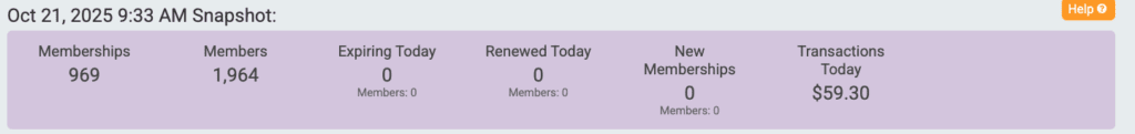
You can click into each of these data points to see where these numbers are pulling from and view a report with this information.
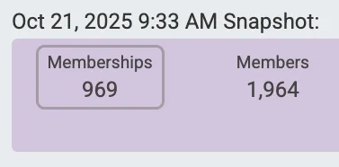
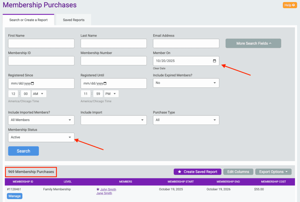
For example, we clicked into the 969 Memberships from the screenshot above.
This returns the Membership Purchases report showing active members on the current date.
This Snapshot will update every minute.
Cards
Next, there are customizable cards that show key metrics on your organization. By default, these show the number of memberships purchased today and a comparison of memberships purchased between this year and last year.
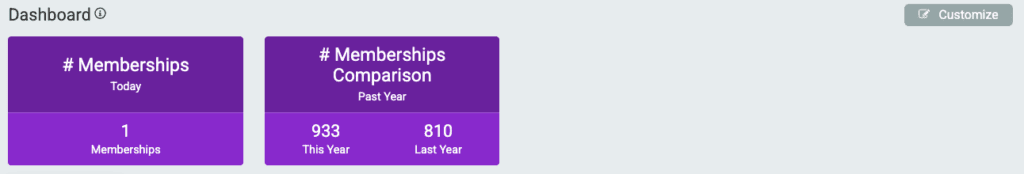
Note: This “Past Year” comparison will look at the last 12 months from the current date.
Customize Cards
Click the “Customize” button in the top right corner of this cards section to edit the current cards or add additional cards to your dashboard.
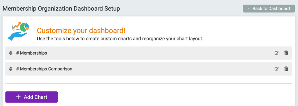
When adding a new chart, you first need to select the Chart Type.
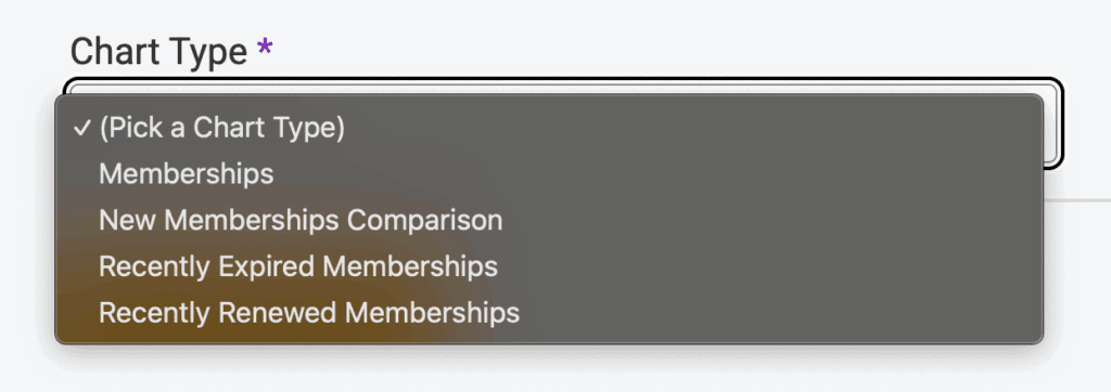
With New Memberships Comparison cards, you can choose to compare on the following:
- Year to Date
- Past 7 Days
- Past 30 Days
- Past Year (default).
You can also add cards that show active Memberships, Expired Memberships, and Renewed Memberships. With these Charts, you can select to show these numbers based on the following dates:
- Lifetime of the membership organization
- Today
- Yesterday
- Month to Date
- Date to End of Month
- Year to Date
- Custom Date Range
- Past__Days
- Past__Years
Any customizations made to these cards will only show when logged into the director account that made the customizations. These will not automatically apply to any other directors’ Dashboards unless they customize them from their account as well.
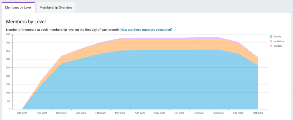
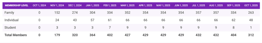
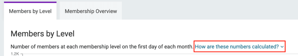
Members by Level
The Members by Level report will show the number of members at each membership level on the first day of each month.
If a membership is active on the first day of the month, it is counted towards the numbers for that month in this report. However, if the membership starts after the first day of the month, it will not be counted towards that month’s numbers in this report.
This data is shown in a graph and a table.
Click the “How are these numbers calculated?” dropdown for further explanation on this data.
Within the Members by Level table, you can click into the “Total Members” for a particular month to view the report for that month and see where this data is pulling from.
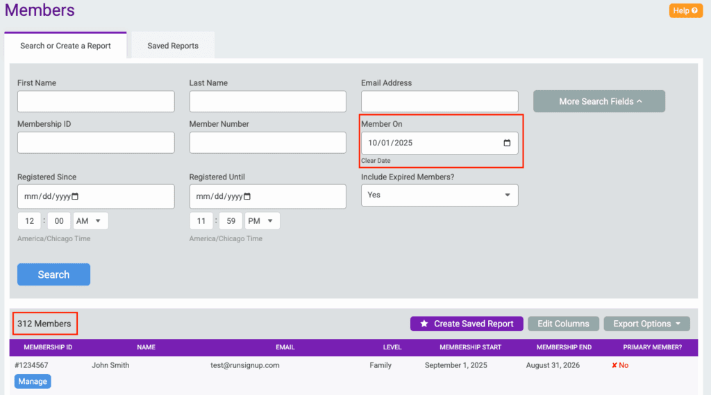
For example, we clicked into the 312 Total Members for October 1, 2025.
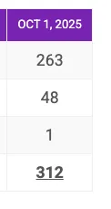
This returned the Individual Members report for October 1, 2025:
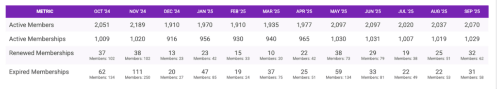
Membership Overview
The Membership Overview report will show a summary of your membership data per month. This data includes:
- Active Members/Memberships: Active at any point during the given month
- Renewed Memberships: Renewal transactions that took place during the given month
- Expired Memberships: Memberships that expired during the given month and were not renewed during that month.
This data is shown in a graph and a table.
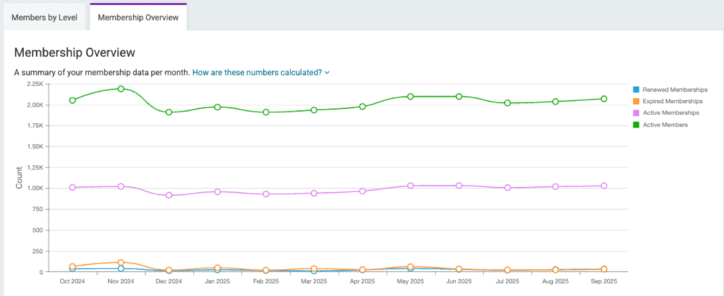
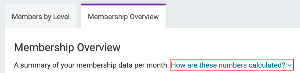
Click the “How are these numbers calculated?” dropdown for further explanation on this data.
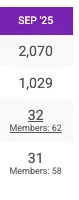
Within the Membership Overview table, you can click into Renewed or Expired Memberships for a particular month to view the report for that month and see where this data pulls from.
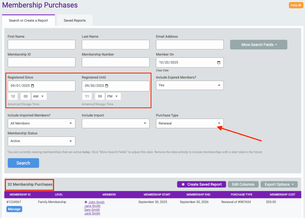
For example, we clicked the 32 Renewed memberships for September 2025.
This returns the Membership Purchases report filtered by Renewals in September 2025:
How do customers use these Dashboard Reports?
We asked a few customers to share how they use their new Dashboard Reports and what they like about them. Here is what they had to say.

Keith Kulesza with the Richmond Triathlon Club
“I like the graph that shows how our 3 membership levels and total memberships have changed over time. [It] gives a very quick snap shot on how we are progressing”.
Keith also mentioned that they “like getting a quick snapshot at the top that lists our current members and memberships along with new memberships month to date and expired members for the year. [It] gives us all of the key information we need with just a quick glance”


Benjamin Burke with the New Orleans Track Club
“The snapshot is great as it identifies clearly what users want to see upon arriving at the dashboard.”
In addition, “I like that the renewed and expired memberships gives you the option to select on those and direct you straight to memberships and members. Same for the membership levels.
Lastly, Ben mentioned that he likes that “hovering over the set circles representing each month highlights the exact number of active members active memberships, expired memberships and renewed memberships” in the Membership Overview graph.