Email and Web builder Interface Updates
Today we launched a few improvements to the email and web builder tools. Before I tell you about these improvements I would like to talk about why we make changes like this.
Because our platform is so robust it is also complex. Our job as User Experience designers is to manage that complexity and make the interface easier for you the user to understand and use. One of the key things we do is to continuously look for ways to improve our tools. That can take the form of improving the layout of the interface or making the code more accessible / inclusive to everyone. These small continuous improvements make our products better continuously over time.
So keeping all that in mind we have released some significant interface improvements to the email and web builders. Here is a list of the changes:
- Remove excess padding around the elements to give a more accurate preview of the content.
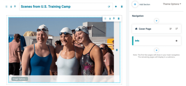
- Updated the actions menu that you see on hover so it is fixed in the right corner and look more like a menu.
- The image options on the image component now lays over the image so it takes up less space and maintains consistency with the video and playlist options.
- Finally some minor layout improvements on the front end of the website including removing the borders that appeared between the sections.
Here are some examples of the updates:


